There is a lot of mythology (and some controversy) around The Golden Ratio, thanks at least in part to it featuring in films like The Da Vinci Code.
Putting that aside, The Golden Ratio is a useful technique to apply to your mailings to produce a design that is pleasing to the eye (and therefore more likely to appeal to your recipients).
Don’t Worry About The Maths!
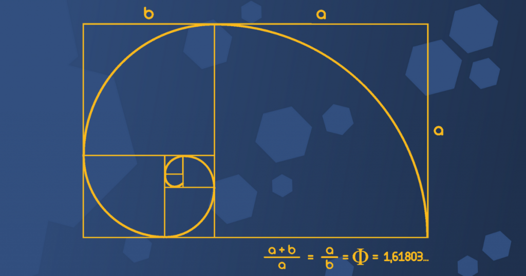
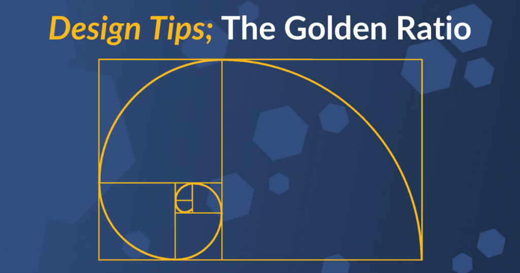
The Golden Ratio is derived from an irrational number, signified mathematically with the Greek symbol Φ (Phi). Because it’s irrational it’s actually never ending; 1.61803398874989484820… (and so on!)
However, we don’t need to worry about the maths, for practical purposes we can approximate it to 1.62.
(If you do want to get into the maths behind Φ there are very informative pieces about The Golden Ratio and the closely related Fibonacci Sequence on the Maths is Fun website.)
How Does This Help Me?
Using the Golden Ratio in your designs is simply a tool you can use to help create a design geometry with aesthetically pleasing proportions by applying the ratio 1:1.62.
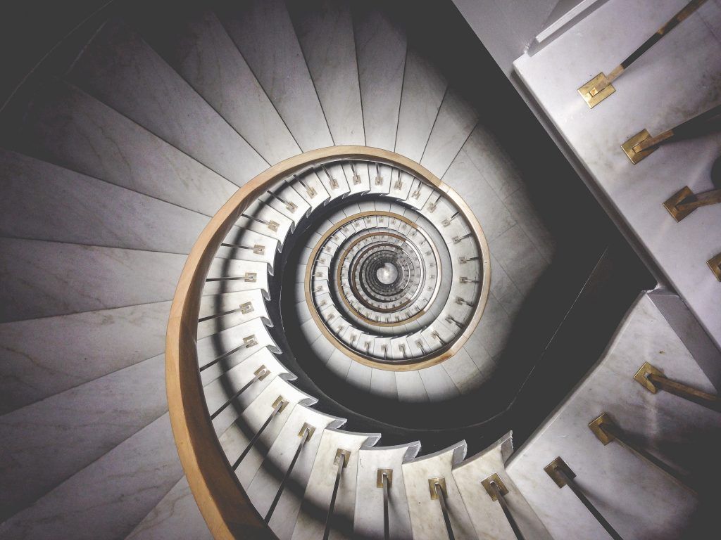
Whilst the ‘classic’ interpretation of The Golden Ratio is the spiral shown above, these proportions can be applied in a similar way to other shapes too;


Taking these proportions into account as you lay out your design will help your mailing look appealing to your recipients.
For example, you could divide your design into 1:1.62 rectangles starting from the left hand side, laying out your key design elements on the proportions of the rectangles.
Fonts
Another great approach is to use these Golden Ratio to set the proportions of your text, for example;
- If you’re using a 10 point font for your text try a 16 point (10 x 1.62) for your headings.
- If you’re using a 12 point font for your text try a 19.5 point font (12 x 1.62) for your headings.
- If you’re using a 14 point font for your text try a 22.5 point font (14 x 1.62) for your headings.
Why Does It Work?
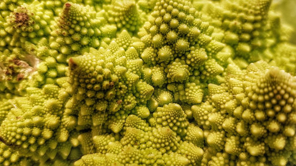
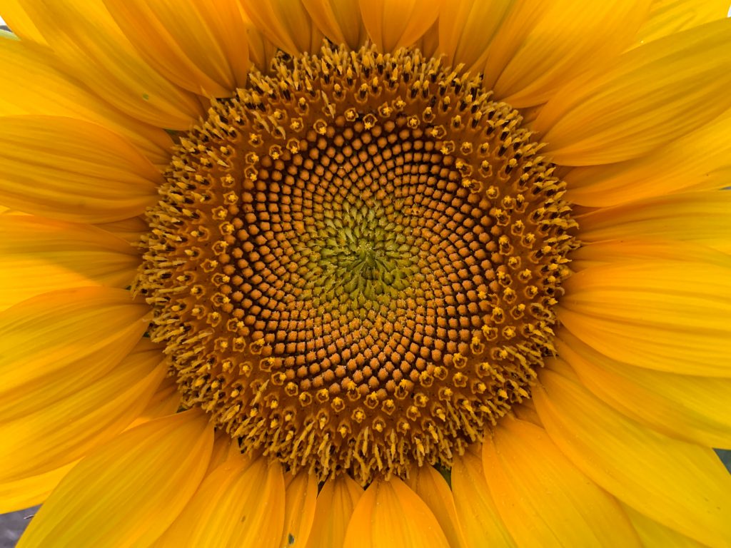
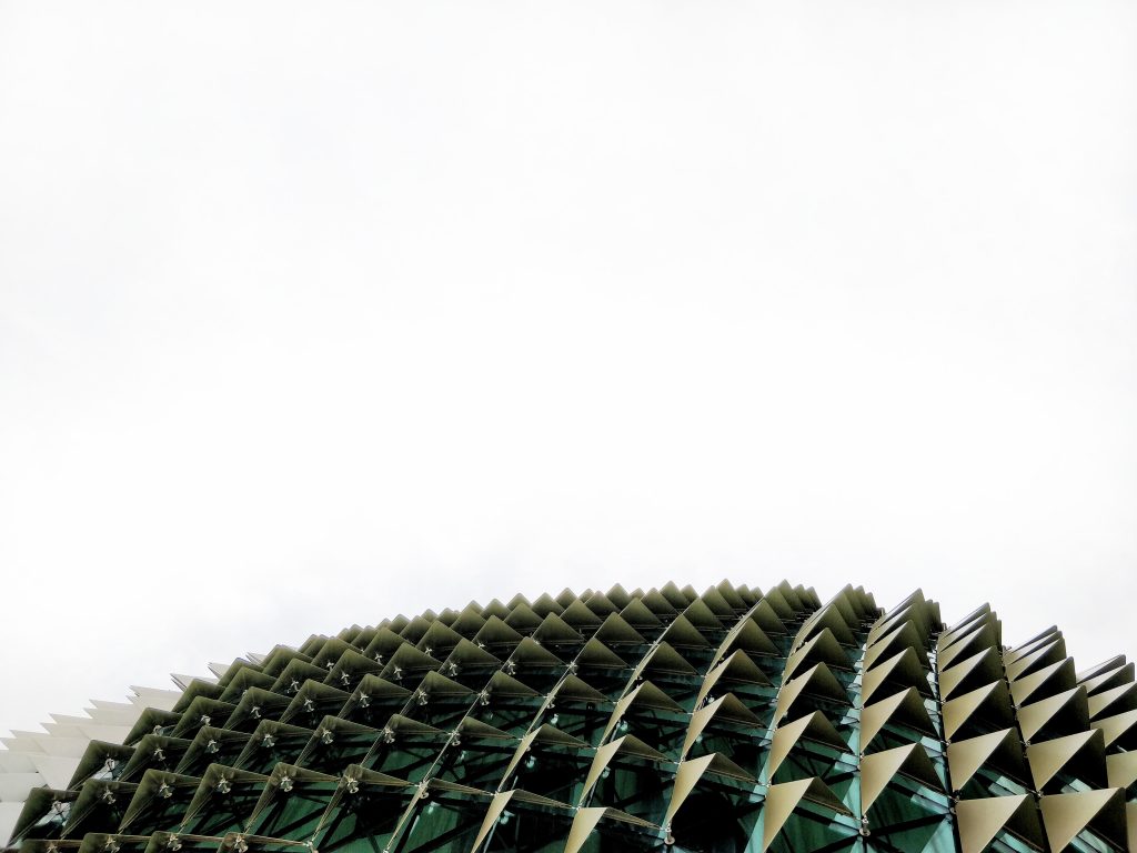
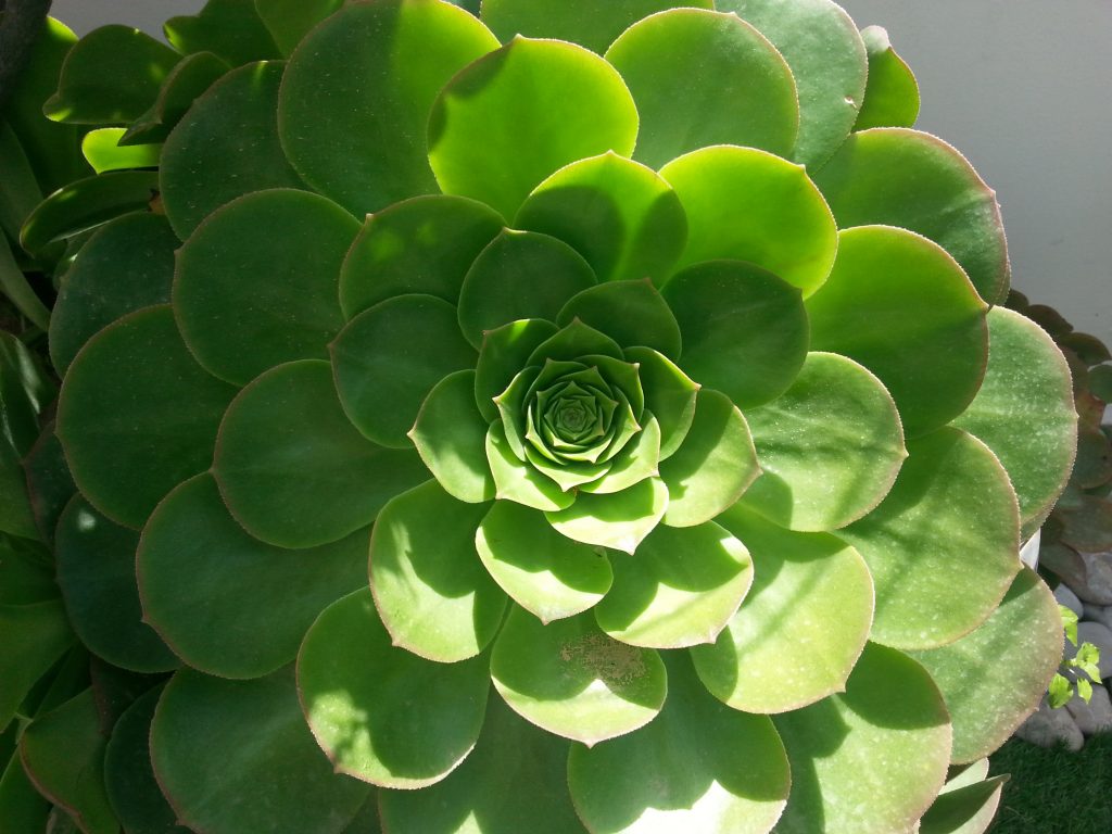
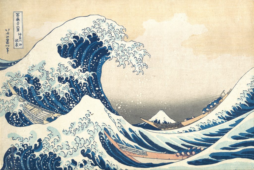
The Golden Ratio is appealing to the human eye because it creates designs that have an ‘organic’ feeling layout. This is understandable as it occurs so frequently in the natural world (as you can see in the examples below).
In particular there are 3 key characteristics that The Golden Ratio adds to your design that make it pleasing to the human eye.
- Balance; A natural sense of hierarchy and order.
- Spacing; Starting from a ‘blank page’ it can be tricky to achieve a pleasing spacing for your design elements. Using The Golden Ratio as a template spaces your elements naturally.
- Three Way Split; The layout naturally splits into three unequal (but proportionally balanced) elements, highlighting the important elements of your composition.
Real World Examples
Once you start looking for them you can easily find examples of the Golden Ratio and the Fibonacci Sequence in both nature and man-made designs;


Many logo designs also make use of the pleasing symmetry of The Golden Ratio;
(Logo examples from Clever Mark Store)
If you are an Adobe Illustrator user there are also some Golden Ratio Templates available on Dribble (created by Ravi Joon) that you may find helpful.
We hope you found our design tips article about The Golden Ratio interesting. If you have any comments or feedback we would love to hear from you.
For more helpful hints, tips, guides and info find us on Twitter, Facebook and LinkedIn, or feel free to speak to your account manager if you have any questions or need any help.


